Razwan Ul-Haq
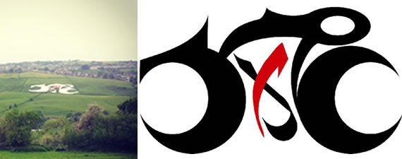
A stunning piece of artwork has been created across the Yorkshire Hills to commemorate the Tour de France bike race.
The Arabic Calligraphy is morphed in the shape of a cyclist on a bicycle and spells out the Arabic word, al-Asr, which means, the Time. The dimensions of the calligraphy are taken from a bicycle ridden by Bradley Wiggins in recognition of his being the first British winner of the Tour de France. My starting point is the Worth River and the sense of time it takes for it to carve out the valley. Time is also the critical factor in deciding who wins the Tour de France. Step back in time and our space is inhabited by the Brontes. In Arabic, things may appear timeless but time is a relative concept. We began with water. And water has been used to measure time. One of the more famous water clocks is Al-Jazari’s Elephant Clock from the 13th Century which used water to control the timing mechanism. Time is a central axis of our existence. Even one of the chapters of
the Qur’an has The Time as the title.
The calligraphic design itself is influenced by minimalism and may possibly seem
Bauhaus, though has a Kufic geometric taste and in that sense goes back over a thousand years. In fact, the calligraphy was created and placed upon the hill using mathematical relationships, reminiscent of traditional Muslim Architects. Letters are not existing in themselves, and thus a word is not a permanent absolute, just like the finite shell of the bicycle. Paradoxically, I am using both. Yet. The form of the letter and vehicle has been dissolved into recognisable waves. In that sense we are back at the Ocean of ink, and the Worth River. Water tends to fill the shape and changes with the current, and with the container. The cycle race is more about the effects, the long training, the circumstances and the attitudes of the riders. The bike and the race are simply scaffolding. Constructs.
The word and bike are both vehicles. Finite, yet racing towards the Infinite.
Time may be relative but there are certain playful synchronicities at work. As I stand pondering at the edge of Bradford, I share a similarity with the Bronte sisters, in the sense that I too am a descendent of an immigrant. Their father, Patrick Brunty (who later changed his name to Bronte) emigrated from County Down. And as a clergyman he was influenced by religion not unlike myself. The crisp air of Yorkshire has been welcoming to many it seems!
I also like the fact that the first letter of time also means source, usually meaning the source of water in a desert. Linking us back again with the river of the Worth Valley.
I used the measurements of the Bradley Wiggins bicycle for the word “Al-Asr.” As he was the first British Cyclist to win the Tour de France. The size and ratio of the calligraphy to the bicycle used by Bradley Wiggins is in Appendix One.
I am also conscious of the fact that we will need to be practical when we are creating the design to scorch the ground.
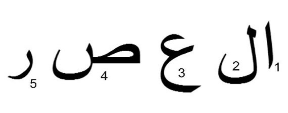
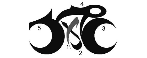
Traditionally, Muslims use mathematics to help them lay a design on a bigger surface. The circle is a key construct in Islamic Patterns. I have therefore used circles as the main scaffolding for the design. The front wheel and the back wheel are circles and the spaces within them are circles too that create the shapes of the first and last letter of “Time” The word “al” is contained within the bike (this is graphically explained in Appendix Two). The observers and any hovering cameras will need to see it from above. I have used red and black, but we needed to alter the colours, as explained in Appendix Three.
Appendix One: Proportions of the Arabic
The dimensions of the calligraphy are taken from a bicycle ridden by Bradley Wiggins in recognition of his being the first British winner of the Tour de France. It was also important for me not to follow the shape of the manufacturer too closely, so I took the ratios of Bradley Wiggin’s bike below. I hope the observer would be taken back to Britain’s success in Tour de France whilst contemplating the Art. Not only is it Arabic, not only does it resemble a bicycle, but it also has a connection with the first British winner of Tour de France.
Appendix Two: The position of the letters
Appendix Three: Colour
We experimented with colour. Black is the traditional colour. Red and black are jointly used in Chinese. They stand out well against a white background. However, we finally opted for white, with some red. This actually turned out great as we originally looked at the white chalk geoglyphs that one founds in the South of England.


